Summary: A professional website boosts credibility, enhances user experience, and aligns with business goals. Instead of relying on generic templates, this guide walks you through creating a custom website step by step—from defining goals and understanding your audience to wireframing, typography, and refining your design. Learn how to build a high-performing website that stands out and drives results.
Introduction
A professional website does more than establish your online presence—it enhances credibility and builds trust with potential customers. It allows you to present your products or services clearly while addressing key questions your audience may have.
However, not all websites are created equal. Many businesses fall into the trap of using generic templates that are reused across countless sites, leading to higher costs and a lack of uniqueness.
In this guide, you'll learn how to build a custom website tailored to your business without relying on overused templates. But before we dive into design, we must first define what makes a website truly professional.
What is a good and professional web design?
A good web design is visually appealing, easy to navigate, fast-loading, mobile-friendly, and user-centered, ensuring both aesthetics and functionality work together to create a seamless experience.
A professional web design goes a step further—it strategically aligns with your business goals, directly influencing conversion rates, sales, and overall revenue.
With a clear understanding of what makes a professional web design, let’s begin our step-by-step journey to creating a website that stands out.
How to design a professional design?
Define your business goals
A website isn’t just an online presence—it’s a tool designed to achieve specific business objectives. Before you start thinking about design, take a step back and ask yourself:
- Why do I need a website? (Credibility, Branding, Sales?)
- What is the primary purpose of my website? (Generate leads, Sell products, Build an audience?)
Answering these questions gives you clarity on your business goals. With that clarity, you can outline everything your website needs to communicate to your audience.
Understand your audience
With a clear understanding of your business, the next step is to identify your audience. Ask yourself the following questions:
- If they’re new to your business, how will they navigate through the content?
- If they’re potential buyers, what content will motivate them to make a purchase?
- If they’re existing customers, what content will keep them engaged and coming back?
Once you’ve figured out the purpose of your website, it’s time to define the purpose of each page. Each page should cater to different segments of your audience (cold, warm, or hot leads). By doing this, you’ll be able to identify the pain points and desires of each group.
With your business goals and audience needs in mind, you can now design and craft content that effectively guides users toward taking action.
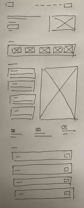
Begin with low-fidelity wireframing using pen and paper
Write and arrange your content for your website
Start by thinking from your audience’s perspective and how you want to guide them through your website. Write down all the content you need, breaking it into clear sections. For example, Content A might go on the landing page, Content B on the about page, Content C on the services page, and so on. This will give you a structure for how your website’s information will flow and ensure that each page has a specific role in guiding your visitors through their journey.
Organize each page with a visual hierarchy in mind
What is a visual hierarchy? According to the NNP group, visual hierarchy refers to the organization of the design elements on the page so that the eye is guided to consume each design element in the order of intended importance.
By considering user psychology, you can strategically group and design content to make the most important elements stand out. Ask yourself these questions:
- What is the most important content on this page?
- How can I use design elements (size, color, contrast) to emphasize it?
- When all elements are placed, how will my users' visual paths flow?
- If users are scanning, do bold headings highlight the key content?
With a clear visual hierarchy, you ensure your content is consumed most effectively, guiding users to take action.
Draw out the low-fidelity wireframe
Now that you’ve established the content structure and visual hierarchy, it’s time to sketch a low-fidelity wireframe. This wireframe doesn't need to include content—just simple lines and rectangles to represent the general layout of your website. Focus on showing the placement of key elements and how users will navigate between them. The goal is to visualize the user flow and ensure your design supports intuitive navigation. This wireframe will serve as the blueprint for the structure of your site.

Why not start directly in Figma?
While tools like Figma are powerful, the design process begins in your mind. Pen and paper are the simplest and most cost-effective ways to start visualizing your ideas. By drafting your wireframe on paper, you have the freedom to iterate quickly, refining your concepts without worrying about the details. Once you move to a digital tool like Figma, you'll already have an evolved version of your wireframe, saving time and increasing the efficiency of the digital design phase.
Transition to Figma (or any design tool) and build your high-fidelity wireframe
Build up your hand-drawn wireframe
1. Set up a grid system.
Begin by setting up a grid system in your design tool. This helps ensure consistency and alignment across your website layout. It also defines the maximum width of your content and provides structure for how your elements will align.
2. Digitize your hand-drawn wireframe
Take the structure you’ve created on paper and translate it into a digital version. Use rectangles, lines, and placeholder text to represent where each element will go. This is your foundation for the final design, so focus on maintaining the same flow and organization.
3. Have a rough draft of whitespace.
While you’re organizing your wireframe, pay attention to spacing. Mark where headings, subheadings, sections, text blocks, and buttons will go. It’s important to give each element enough room to breathe, ensuring that your design won’t feel cramped once you add final content.
Fill up with text (No images yet)
Now that your wireframe is set, it’s time to replace the placeholder lines with the actual content you've written. Here’s how to approach it:
- Add real text
Replace the lines or placeholder text with the copy you've already created. This helps you visualize the flow of information on the page and ensures that the text fits into the layout as intended. - Use placeholder shapes for images
For images, don’t insert the final images just yet. Instead, use simple shapes (such as rectangles or squares) to represent where images will be placed. This lets you focus on the overall layout and content structure without getting distracted by visual details.
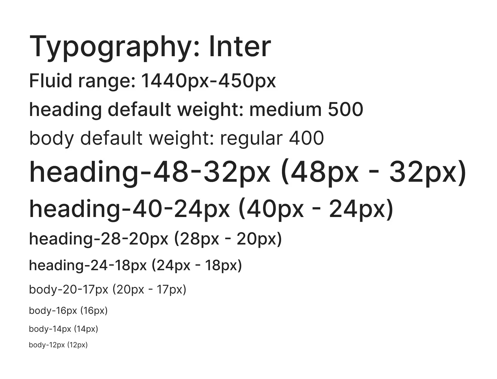
Set up a typography system
Now you have a brief skeleton of your entire website, and you can start to pick up your font. Read this article to pick up a font for your brand.
So generally, we have 6 types of fonts:
| Font Types | Features and Applied Situations |
|---|---|
| Serif (e.g., Times New Roman, Garamond) | Traditional, Trustworthy, Elegant – Often used in formal industries like finance, law, and publishing. |
| Sans-Serif (e.g., Helvetica, Arial) | Modern, Clean, Minimalist – Common in tech, startups, and contemporary branding. |
| Slab Serif (e.g., Rockwell, Roboto Slab) | Bold, Strong, Confident – Often used for impactful headlines and brands with authority. |
| Script (e.g., Pacifico, Brush Script) | Elegant, Creative, Feminine – Best for personal branding, luxury, and artistic designs. |
| Handwritten (e.g., Dancing Script, Amatic SC) | Friendly, Personal, Informal – Works well for creative and casual brands. |
| Display (e.g., Lobster, Bebas Neue) | Unique, Eye-Catching, Playful – Good for branding but should be used sparingly. |
Remember, less is more when it comes to fonts. According to HTMLBurger, using more than three different fonts can disrupt a website’s professionalism, structure, and layout.
Compared with different types, you will have a direct feeling of how the typography is going to affect the feeling of your brand.
By experimenting with these font types, you can get a feel for how typography will influence the overall brand perception. To test your font pairings, you can use tools like Typescale to refine your choices.

Arrange the whitespace to let your content "breathe"
Whitespace is a critical design element that gives your content room to breathe. It’s not just about empty space—it's about creating a sense of balance and order. To make your content visually appealing and easy to consume:
- Group related content together with minimal whitespace to create a sense of connection.
- Use generous whitespace to separate unrelated content, preventing visual clutter and improving readability.
Whitespace helps guide your users’ attention and allows the design to feel clean and organized. When done right, it enhances the overall user experience by reducing cognitive overload and making it easier to navigate your site.
Connect pages with simple transitions
Now that your high-fidelity wireframe is taking shape, it's time to connect your pages with simple transitions. Add navigation links in the header, footer, and body of your website to create a seamless flow between pages.
Ensure that each transition is smooth and intuitive, allowing users to easily move from one section to the next. This step helps you create a prototype that reflects your website’s structure and navigational flow. With these connections in place, you'll have a clean, functional prototype to review and refine before moving on to the final design stages.

Finish your design with details
At this stage, your high-fidelity wireframe is about 70-80% complete, meaning the core structure and visual tone of your website are already established. You now have a general sense of how your brand will be represented online. The remaining steps focus on refining and enhancing your design, ensuring it aligns with your brand identity and provides a polished, cohesive user experience. These details will strengthen your brand’s presence, not change its core direction.
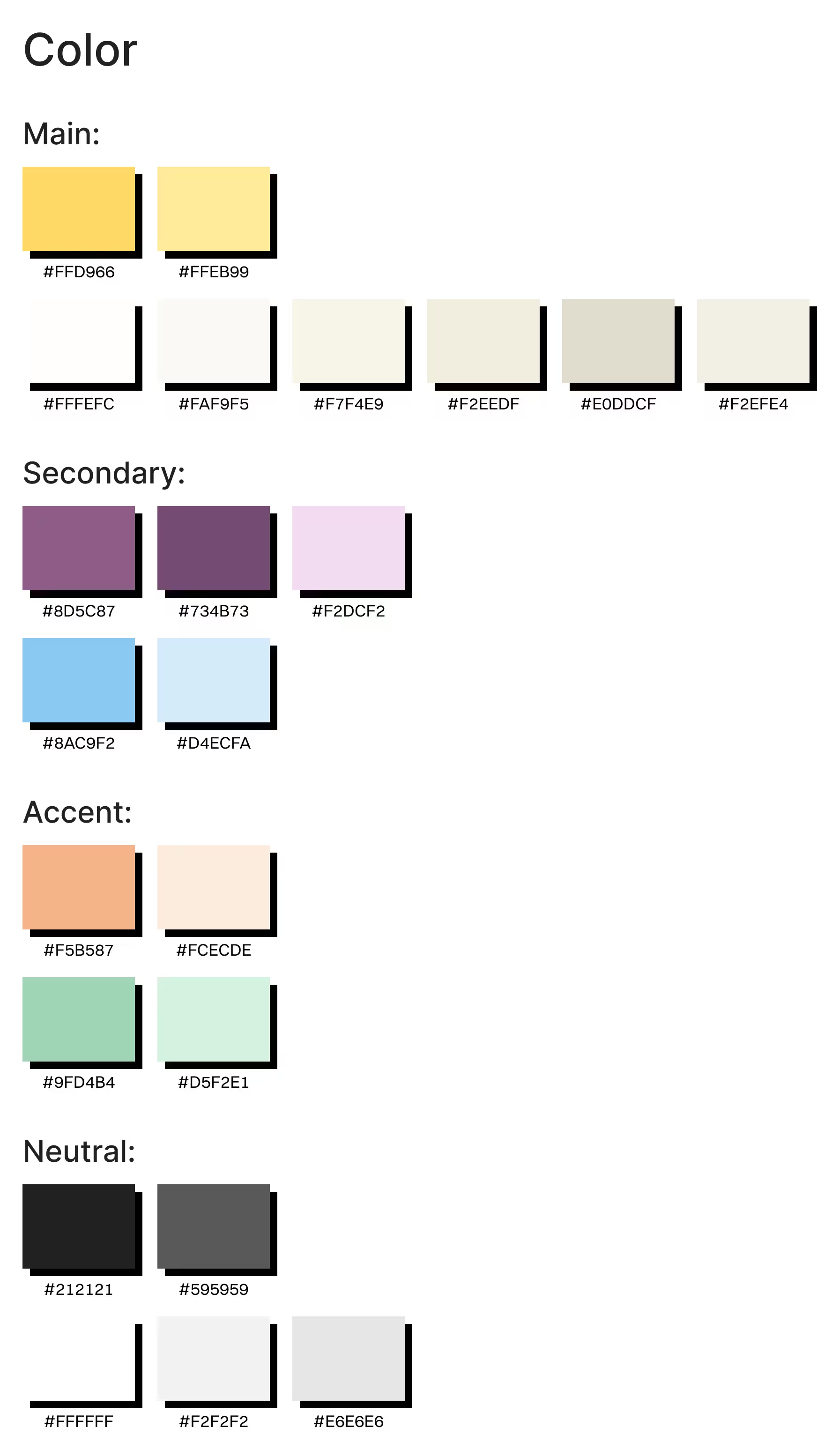
Choose a color scheme that aligns with your brand identity
To choose the right color scheme for your website, it’s essential to understand color models first. Read this article to understand the 3 most used models. Designers prefer to use the HSB (Hue-Saturation-Brightness) model, also explained by Learn UI Design, and it is a far more human-friendly way of describing color.
When selecting a color, start with a saturated one that reflects your brand's values and emotional tone. Refer to the color psychology table to help guide your choice. To dive deeper into the psychological impact of colors, check out articles like this one from Verywell Mind.
| Color | General Meaning & Psychological Associations | Common Uses in Branding & Design |
|---|---|---|
| Red | Passion, energy, urgency, excitement, love, danger | Used in sales promotions, fast food brands, and emergency alerts (e.g., Coca-Cola, YouTube, Red Cross) |
| Blue | Trust, calmness, professionalism, security, reliability | Popular in corporate brands, finance, and technology (e.g., Facebook, PayPal, IBM) |
| Yellow | Happiness, optimism, youthfulness, warmth | Used for cheerful, attention-grabbing branding (e.g., McDonald's, Snapchat, IKEA) |
| Green | Growth, health, nature, wealth, tranquility | Common in eco-friendly brands, health, and finance (e.g., Starbucks, Whole Foods, Animal Planet) |
| Orange | Creativity, enthusiasm, friendliness, confidence | Used in playful and energetic brands (e.g., Fanta, Nickelodeon, SoundCloud) |
| Purple | Luxury, wisdom, spirituality, imagination | Often associated with premium brands, beauty, and mysticism (e.g., Cadbury, Hallmark, Twitch) |
| Black | Power, sophistication, elegance, mystery | Common in luxury fashion, tech, and minimalist design (e.g., Apple, Nike, Chanel) |
| White | Simplicity, purity, cleanliness, peace | Frequently used in healthcare, tech, and modern design (e.g., Apple, Tesla, The North Face) |
| Gray | Neutrality, balance, sophistication, professionalism | Often used in corporate, tech, and modern brands (e.g., Mercedes-Benz, Wikipedia, Apple) |
| Pink | Femininity, playfulness, compassion, romance | Popular in beauty, fashion, and youthful brands (e.g., Barbie, Victoria’s Secret, Baskin Robbins) |
| Brown | Earthy, organic, reliability, warmth | Used in natural brands, coffee, and rustic aesthetics (e.g., UPS, M&M’s, Hershey’s) |
Pick the color that has value:
- Hue: Select a color that aligns with your brand's psychological message.
- Saturation: Aim for a saturation greater than or equal to 85% for vibrancy and strength.
- Brightness: Choose a brightness level greater than or equal to 85% to ensure visibility and appeal.
Once you have your base color, use a tint and shade generator to explore variations and create a palette. From there, you can select up to one primary color, two secondary colors, and one accent color (more if necessary).
Follow the 60-30-10 rule for balance:
- 60% primary color
- 30% secondary color
- 10% accent color
Note: If your brand is serious and elegant, use desaturated colors. If your brand is playful and not serious, use saturated colors.

Create reusable components
At this stage, your website is 80-95% complete, with the overall structure and content in place. Now, it's time to focus on creating reusable components that will streamline your design and ensure consistency across the site.
Start by identifying the most commonly used elements that repeat across multiple pages, such as:
- Headings and subheadings
- Buttons
- Links
- Form fields
By creating a "mother component" for each of these elements, you can control the general properties such as font, colors, line height, and letter spacing. This not only saves time but also helps maintain a consistent visual style throughout the site.
These reusable components will make future updates and adjustments much easier and faster, allowing you to focus on refining the overall experience rather than repeating design tasks.
Fill out those image areas with your chosen picture
Now that your design is nearly complete, it’s time to add the images that bring your website to life. Choose high-quality images that align with your brand identity and enhance the user experience.
While your design file won’t limit the image size, it’s important to consider how the images will appear when the site is developed. To ensure that your images look sharp on all screen sizes, select images that are 1.5x-2x larger than the maximum width and height of the container where they will be displayed. This ensures that images remain crisp and clear, even on high-resolution screens, and prevents pixelation or blurriness.

Review and iterate your design
By this stage, your website design should be nearly complete. The final step is to thoroughly review your work. Take time to test every interaction, check for consistency, and ensure all elements align with your business goals. As you go through the design, note down areas that could be improved, and make adjustments where necessary.
Remember, design is an iterative process. Keep refining until it feels polished, and any adjustments are minimal. When you’re confident that the design is solid and can’t be improved further, you can hand over the design file to your developer to bring it to life.
**Check the Talkiatry redesigned landing page that follows the guide:**
Talkiatry Home Page Redesign
**Here's their original design:**
Talkiatry: Online Psychiatry Covered by Insurance
Conclusion
Define your business goals
Understand your audience
Begin with low-fidelity wireframing using pen and paper
- Write and arrange your content you want to show in the website
- Organize each page with a visual hierarchy in mind
- Draw out the low-fidelity wireframe
Transition to Figma (or any design tool) and build your high-fidelity wireframe
- Build up your hand-drawn wireframe
- Fill up with text (No images yet)
- Set up a typography system
- Arrange the whitespace to let your content "breathe"
- Connect pages with simple transitions
Finish your design with details
- Choose a color scheme that aligns with your brand identity
- Create reusable components
- Fill out those image areas with your chosen picture
Review and iterate your design
With these steps in mind, you are ready to design a customized and professional website that will not only meet your business goals but also provide a great user experience.
Building the perfect website takes time, and sometimes, a second pair of eyes can help. If you’d like expert feedback or need help bringing your design vision to life, contact us to see how we can help you.