Harbor

Summary

Harbor is a fictional practice we made up to explore how a boutique mental healthcare practice can earn trust before anyone calls.

Project details

Type
Concept
Industry
Healthcare
Year
Services
  • Strategy
  • Design
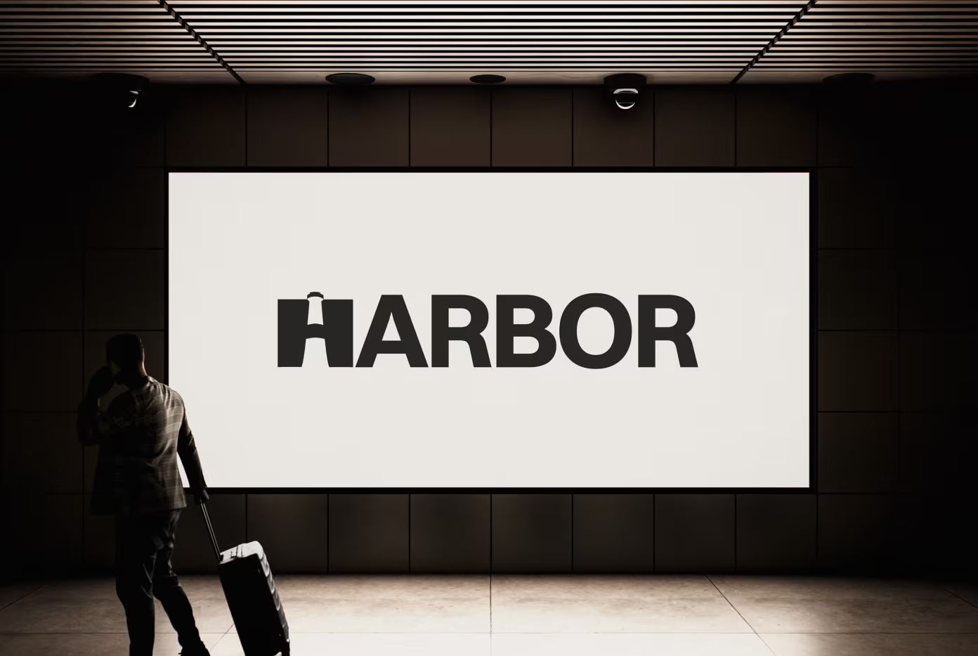
Harbor logo on a large lit screen in a dark hallway, a traveller walking past

The project

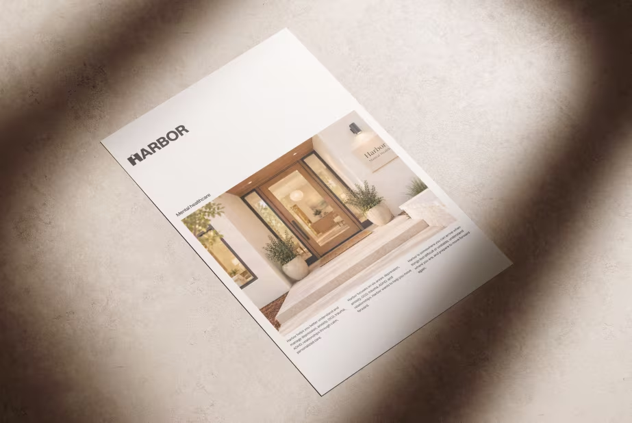
  • Harbor flyer with a photo of the practice's entrance, lying on stone in dappled light
  • Harbor's lighthouse H on a sign hanging outside a building
  • Harbor poster with a photo of friends watching the sunset
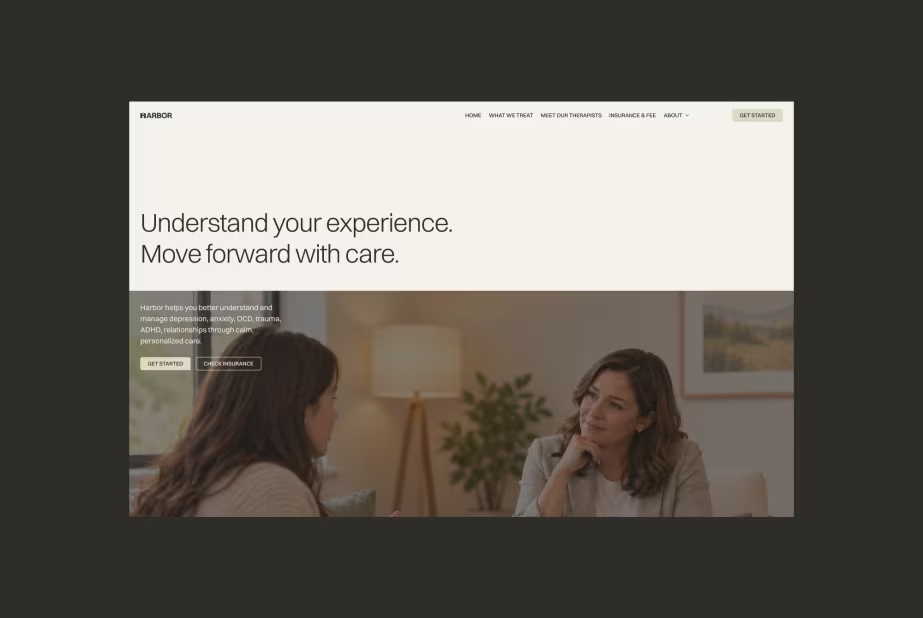
  • Harbor website home page: Understand your experience. Move forward with care.
  • Harbor's typeface, Switzer
  • Harbor's palette, from warm off-white to near black
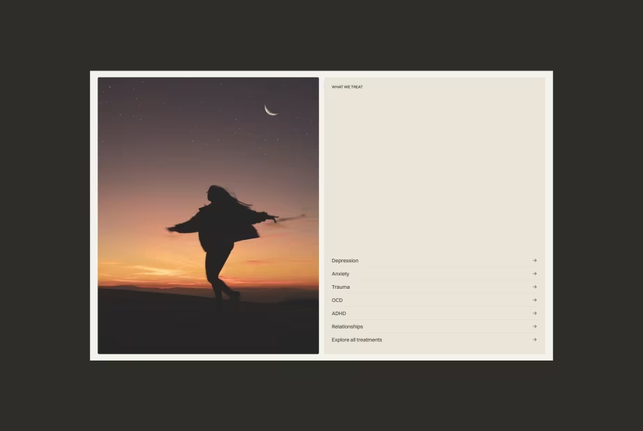
  • Harbor website section listing what Harbor treats, beside a photo of a woman dancing at dusk

The brief

Choosing a mental healthcare practice starts with trust, often before anyone picks up the phone. We set ourselves this brief: make a boutique practice feel calm and credible from the first look, without feeling clinical.

Our answer

An identity built on a lighthouse inside the H of Harbor, a warm palette from off-white to near black, and one typeface, Switzer. It carries through signage, print and a website that says what Harbor treats and how to take the first step.

What we'd measure

With a real practice, we'd watch how many visitors go from what Harbor treats to the contact page, which treatment pages people read before they get in touch, and how many first calls the site brings each month.

01 - 07

  • Harbor flyer with a photo of the practice's entrance, lying on stone in dappled light
  • Harbor's lighthouse H on a sign hanging outside a building
  • Harbor poster with a photo of friends watching the sunset
  • Harbor website home page: Understand your experience. Move forward with care.
  • Harbor's typeface, Switzer
  • Harbor's palette, from warm off-white to near black
  • Harbor website section listing what Harbor treats, beside a photo of a woman dancing at dusk